Can an Expensive Website Template Make up for Low-Quality Photos?
What strong brands do exceptionally well is to align all of their communication channels with their brand's set of visual and verbal design choices.
Many websites use photos, videos, and illustrations — called visuals — to tell their stories.
Unlike visual brand storytelling, editorial brand storytelling conveys the brand's message through long-form text. Often visual and editorial storytelling are combined to appeal to a broader range of customers.
But what if your photos or videos are of low quality? Can you compensate for this deficiency by spending more money on an expensive website layout and still achieve a premium brand feel?
In my experience, the short answer is: it's unlikely. Here is why.
Your Website is Like a Three-Legged Stool
The effectiveness of your website's brand storytelling depends on how much your layout, visuals, and texts — the three legs — are balanced.
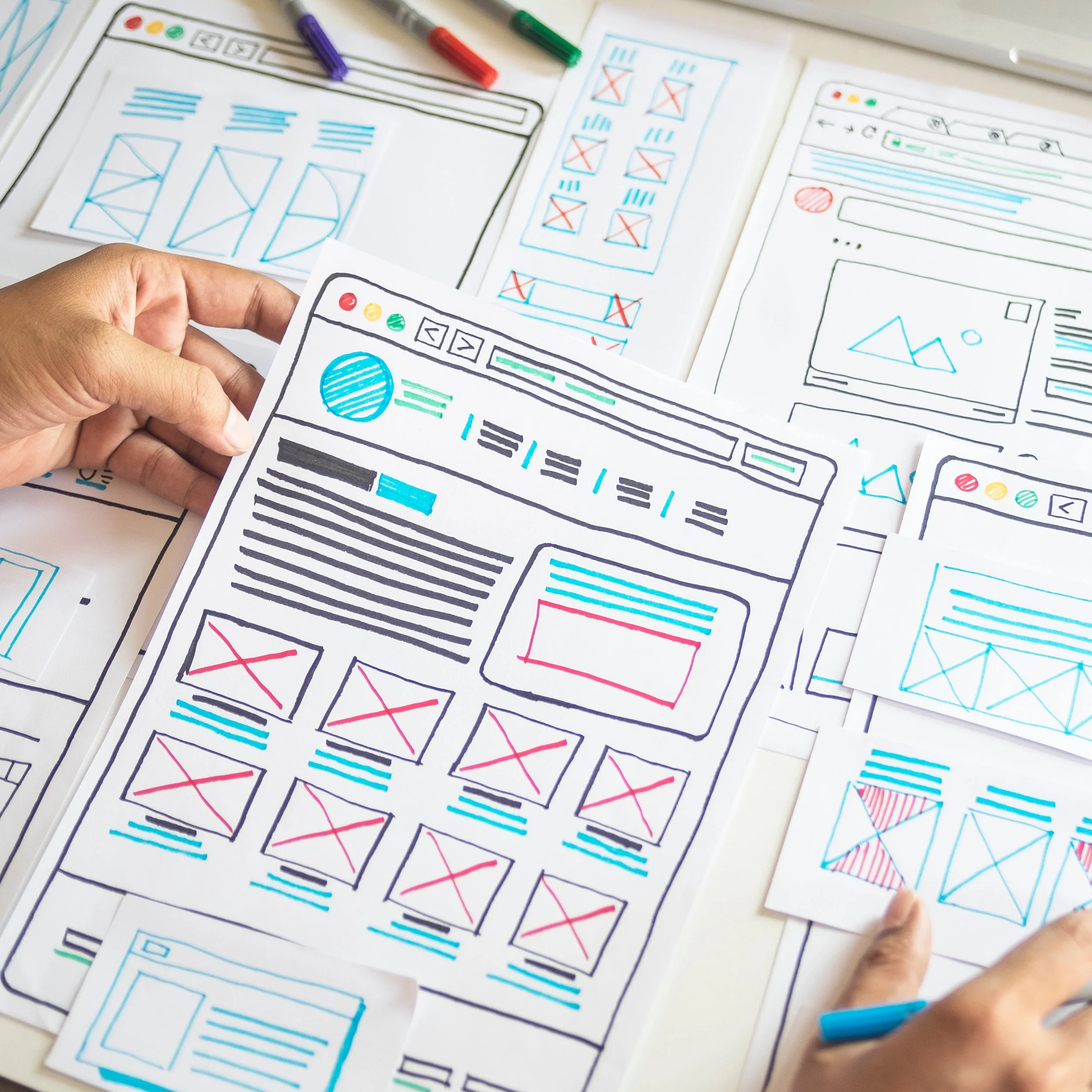
For example, if the quality of your photos is lower than your website layout, the three-legged stool will be out of balance and lean towards one side. Spending more money on an even more sophisticated web design, hoping to offset the lack of premium images, will only worsen the tilt or imbalance, making your website look out of place.
A better approach would be to upgrade your visuals and texts first and then invest in a higher-end website layout.
But how do you know if one of the stool's legs is too long or too short, or in other words, if you are spending too much or too little?
That's where your brand compass comes into play. If you don't have a brand compass yet, you should really consider developing one.
Strong Brands Align Their Website With Their Brand
A website is one of several potential channels a brand can use to engage with current and future customers. What strong brands do exceptionally well is to align all of their communication channels with their brand's set of visual and verbal design choices. In addition to their website, this also includes social media, business cards, and email.
For example, suppose your brand wants to be perceived as budget-friendly, but you show high-end photos on your site using a low-cost layout. This contradiction or imbalance can weaken your brand's appeal with your target audience, which, in my example, looks for less expensive products. A visitor could perceive high-end photos as out of place.
Conversely, premium brands spend a lot of money on high-quality photos and videos and display them in a refined website layout to engage with high-end shoppers.
The strength of your brand and, thus, its appeal to customers is significantly influenced by how well all brand design elements align across all communication channels. Brand coherence is a high bar to clear. But if you do, you can reap the many benefits of a strong brand.


