Is Your Website Responsive?
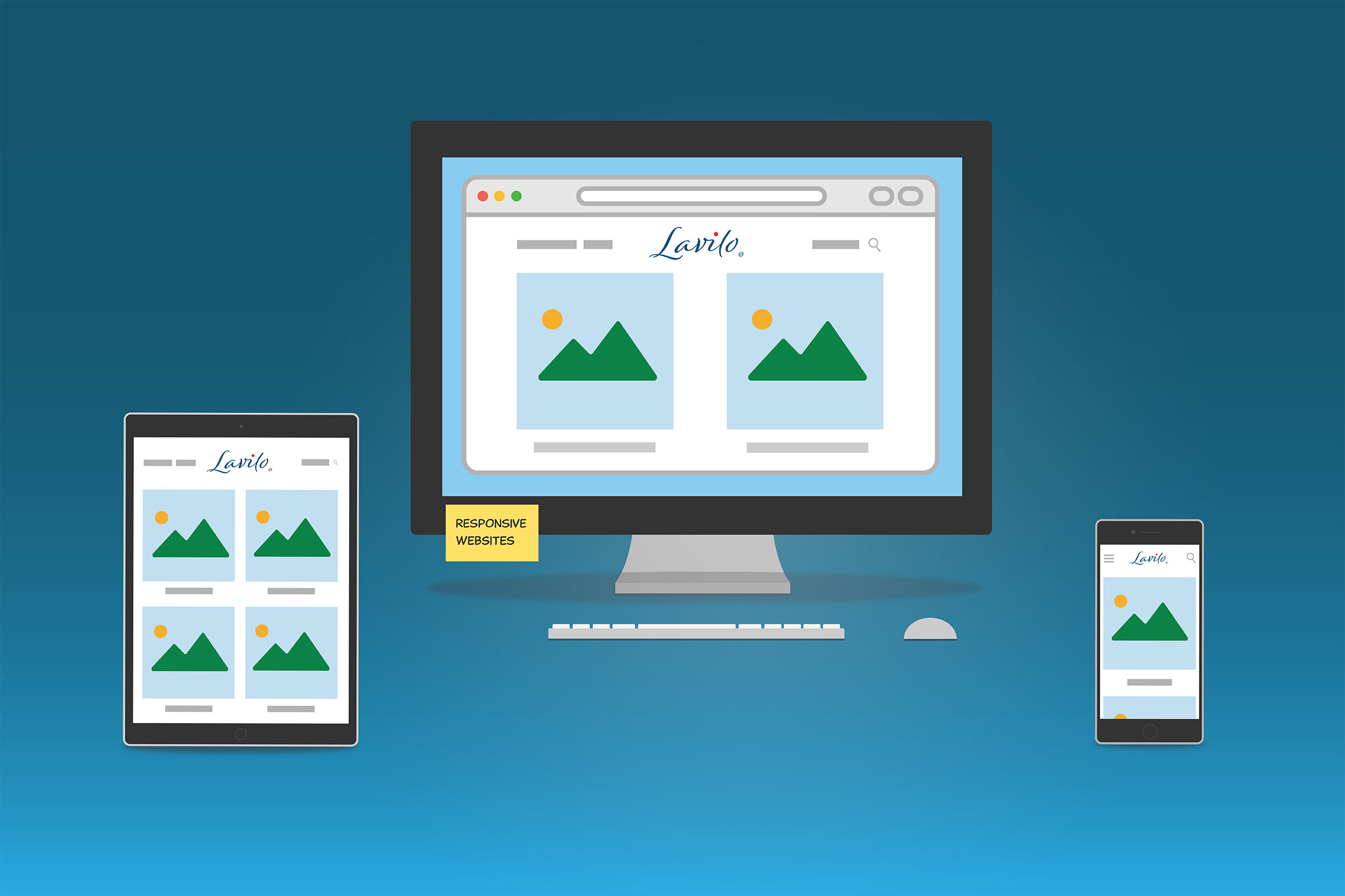
Web designers call a website responsive when it automatically adapts to different screen sizes. You can quickly test this on a desktop computer. Open your website in a browser and start to shrink the browser window slowly. What do you see? Is the navigation menu displayed differently, perhaps hidden in the top left corner behind three or four horizontal lines, called a hamburger? Is the content of your site still legible? What about your pictures, did they scale properly?
If the answer to any of these questions is "no", then your website is probably not responsive. While your site may look good on a desktop, it may look tiny on a smartphone. Why should this matter?
Ask yourself: how often do you read a website on your smartphone or tablet? I suspect quite often. Have you noticed that most web pages on your phone look very good even though their layouts appear differently on a desktop? As screen sizes vary by device type, responsive websites take these dimensions into account when they rearrange your content. The result is a website that looks stunning and professional on any device.
When thinking about upgrading your website, you may want to consider a platform provider, such as Squarespace, Shopify, or Wix. Their templates aren't just a convenient way to implement a professional website, but they also come with responsiveness built-in and look exceptional on any device.