Decoding Typography
I admit it; talking about typography is rarely a crowd-pleaser. The Wikipedia definition certainly does not help to stimulate more excitement: "Typography is the art and technique of arranging type to make written language legible, readable, and appealing when displayed."
Why? Because users usually do not pay much attention to the fonts on the website they visit — until they have difficulties deciphering the text.
Discussing typography with clients may not be as exciting for them as discussing their site's layout or stunning photography, but it is a crucial part of your visual brand identity. ► Why Your Visual Brand Identity Matters
A purposefully chosen typeface can add emotion and a distinctive character to your brand and, as such, is an essential visual design element.
Typeface vs. Font
Although we often use the term typeface and font interchangeably in many discussions, there is a clear distinction between them.
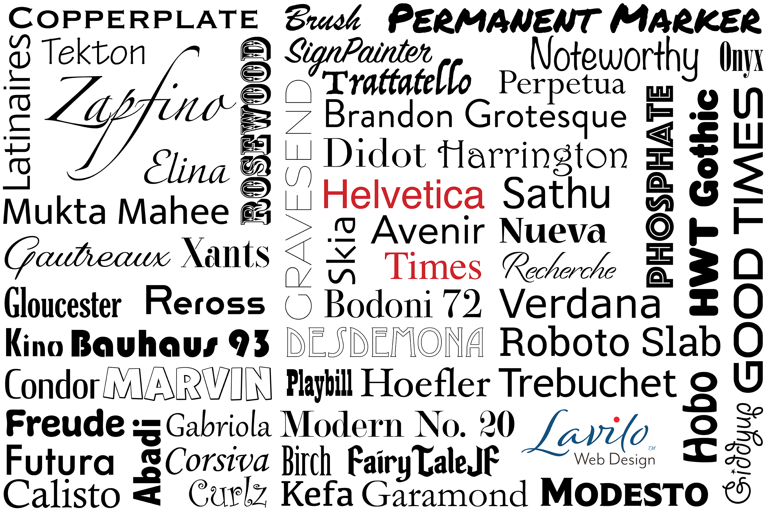
Typeface refers to the collective name of related fonts, while a font is a specific member in such a collection. For example, Helvetica is a typeface that consists of various fonts, such as Helvetica Light, Bold, and Oblique (Italic). In this regard, a typeface is like a font family whose members are called fonts. Every typeface has at least one font.
Typeface Categories
In overly simplistic terms, typefaces can be split into three broad categories: serif, sans-serif, and decorative.
Serif Typefaces
Serifs, such as the typeface Times, are mostly used in printed materials like books and newspapers. They originated in the Latin alphabet and were used in stone engravings during Roman antiquity. That may be the reason why serif typefaces are also referred to as Roman.
Letters or symbols of a serif typeface feature a small line - the serif - that is attached to the end of a larger stroke. Whether these serifs were added to make them look neat when chiseled into the stone, is unknown today. Either way, serif typefaces look very classy and distinguished, giving the text a more official or academic appearance.
Although a favorite in print, serif typefaces are rarely used on web pages. In the early days of the Internet, when the screen resolution of our tube-based monitors was very low, serifs were hard to read. Instead, typefaces without the serif — so-called sans-serif typefaces — looked much cleaner and crisper and eventually became the norm.
Sans-Serif Typefaces
As the name implies, sans-serif typefaces are without — sans in French — the serif. They are sometimes also called grotesque typefaces. Perhaps the best-known and most popular typeface in this category is Helvetica. Developed in 1957 by Swiss typeface designer Max Miedinger and Eduard Hoffmann, Helvetica strips the letters down to their basic form, giving them a modern, clean look. It is no surprise that many global companies have chosen Helvetica for their commercial trademark. You may have also noticed that Apple's system fonts on all their devices are sans-serif typefaces.
Decorative Typefaces
Typefaces that are neither serif nor sans-serif fall into the broad category of decorative typefaces. Whether they are inspired by handwriting, Art Deco, calligraphy, brush pens, markers, or the Gothic, decorative typefaces offer an abundance of choices. Unlike serif or sans-serif typefaces, they can give your website a personal touch or evoke emotions.
If I have now stimulated your imagination to showcase your creativity by using many different decorative typefaces, I recommend not to overdo it. A concentration of varying font families on a single page can make your site appear messy and can often also lead to confusion.
Create a Typeface Hierarchy
Don't choose your fonts at random or just because they look pretty.
Instead, create a typeface hierarchy, starting with the typefaces you have chosen for your logo.
For example, if your logo uses a decorative font, you could use that font family in your headlines. You can also apply your logo colors to your headlines if you want a little more punch. However, as a general rule, regardless of the font you use in headings, I highly recommend your main text to be written in a typeface that is easy on the reader's eyes, such as Helvetica or Verdana.
How to Choose Typefaces
If you go through the list of available typefaces, it is easy to get carried away. The possibilities seem to be endless. Here are a few tips to narrow your search.
Shortlist the typefaces that best reflect your company's brand. Whether you have a physical or an online store, it has a personality. Imagine if your store was a person who would that person be? Would that person be an open-minded world traveler with a penchant for trying something new, something bold? Or would that person be a classy, quality-loving enthusiast who does not stray too far off the proven path?
Depending on how you describe that person, your description outlines your business's personality - your brand. Try to focus on those typefaces that best suit your brand.
► 5 Reasons Why You Should Strengthen Your Brand PersonalityChoose typefaces in your logo that are also available on Squarespace. Some graphic designers pick typefaces for your logo that are so unique that even Squarespace's vast font library does not carry them. That would be a bummer. If Squarespace does not have your logo's font, you would then need to find the closest match for your headlines. And the closest match is very often just that - a close match.
It would be better to first check what typefaces Squarespace offers and then choose one or two from their list for your logo. There are ways around this limitation by inserting extra code, but why should things be more complicated than necessary?
Avoid fonts that can strain your reader's eyes. Picture yourself starting to read a text on a website you just clicked on. The photos are stunning, but the font seems small, the letters slightly overlapping, and the line spacing appears narrow. After the first few paragraphs, your eyes begin to tire. It is exhausting for your eyes and brain to decipher text that is hard to read. Annoyed from the illegibility, you leave that site with another click. This is not unique but happens daily many times over. In general, we - the visitors - do not want to work hard to read the text, because we do not need to. There are so many competing websites with similar content on the Internet that we do not bother and simply go elsewhere.
As you have seen from my example, your text's font family is not such a good place to show your creativity. Instead, stay with the proven ones. My favorites for the main text are Helvetica or Verdana, but similar typefaces can work just as well.
Give Your Text Some Breathing Space
The subject in an iconic photo is always nicely separated from the background and just the right distance away from other objects in the picture. You may have also noticed that iconic photos never look cramped or cluttered. The same goes for high-end museums or art galleries. There is always ample space around the exhibits. Why? Because negative or white space lets your subject stand out.
Written text is no different.
Leaving plenty of space on your web page not only makes it look neat but also makes your headlines pop even more. It also brings your copy clearer in focus.
Unless you do it on purpose, my advice is not to fill your page from edge to edge. Also, avoid overlaying your text over strong patterns of background images. Otherwise, your copy becomes very hard to read.
Align Your Typefaces With Your Brand Compass and Brand Personality
There are no clear rules about what typefaces will and will not work on your website as long as the typefaces complement your brand.
When we develop a logo for a client and shortlist typefaces, we make sure that they align with our client’s brand compass and brand personality.
► What Is a Brand Compass and Why Your Business Should Have One
► 5 Reasons Why You Should Strengthen Your Brand Personality
We then go through the shortlisted typefaces, change their sizes and vary the position of the brand name and tag line in the logo. The effects are sometimes substantial. So, don't be afraid to try the funkiest things. The best designs often happen by accident.