I Don't Want My Website to Look Like a Template
When I recently discussed templates with a client, I sensed some hesitation. After reviewing our vision for his new website and agreeing on the general layout and image ideas, I still felt that he was not entirely convinced about basing his website on a template. As it turned out, he was concerned that his new site might look like a template.
In broad terms, I agree with his concern. Before we started using Squarespace as our platform provider of choice, we always felt some design limitations, especially with certain free templates that some providers include in their paid subscriptions.
Squarespace seems to be an exception in this regard. They include all of their templates in every subscription plan they offer. And their templates are well designed and very flexible.
But back to my client. Here are the main points of my hopefully convincing explanation of why his website will not look like a template.
Templates are design containers with a specific set of capabilities. When platform providers design templates, they typically do not add the same capabilities to all templates. Some templates are more flexible than others or are designed for a specific purpose, such as blogging or selling products. However, it is entirely up to you and your web designer to decide which particular capabilities you use for your website and how. Although an artist, a bakery, and a general contractor may base their website on the same template, their final sites will always look very different. With a little imagination, you can see that you do not need to use the blogging feature just for blogs. In the case of a general contractor, you can also use it to showcase past customer projects. In other words, templates offer you a toolkit from which you can pick the tools you want to use in your design. How you apply them is entirely up to your imagination.
Templates consist of building blocks, and this is great news. I do not want to bore you with the coding stuff that happens behind the scenes. However, it is critical to understand the benefits of using templates. Since these templates consist of building blocks, you, as the owner of your website, can maintain your site without involving and paying a web designer. That is great news. You can easily create a new blog post yourself, replace an existing photo with another image, or add new products to your online store. Just insert a new building block or click on an existing one, and you can make these changes quickly without knowing HTML code.
Templates save you time and money by not reinventing standard features. When designing a website, there are many features that all web pages have in common. Take the header and the footer, for example. The header usually contains your logo and the navigation menu, while the footer displays your terms and conditions, privacy policies, useful links, and contact information. In most cases, I do not think that there is a compelling reason to come up with something drastically different. Let's look at the body of your web page. The body holds, for example, your images, either as a single photo, slideshow, or gallery. You will probably also have a text about your company. Some web pages show upcoming events or their location on a map. Although all of these design elements are the same on most web pages, they can be placed and styled differently to best support your goals and objectives.
Choosing a template is always a compromise. With each platform provider offering a large selection of templates, even for professionals, the choice can sometimes be challenging. In particular, if you include the paid templates from third-party software companies in the mix, deciding on the most suitable template for your business can quickly become a search for the best compromise. You want to get it right because changing your template later, means that you have to start over. However, with the latest software version (7.1), Squarespace has combined all conventional templates in a single design container with the same features and functionality. This single-template strategy is a significant step in the right direction not just because it makes designing a website much easier and more future-proof, but also because you no longer have to find a compromise.
Templates are always just a starting point. To better understand why this is the case, I would like to explain how web pages work. Web pages usually consist of three cornerstones.
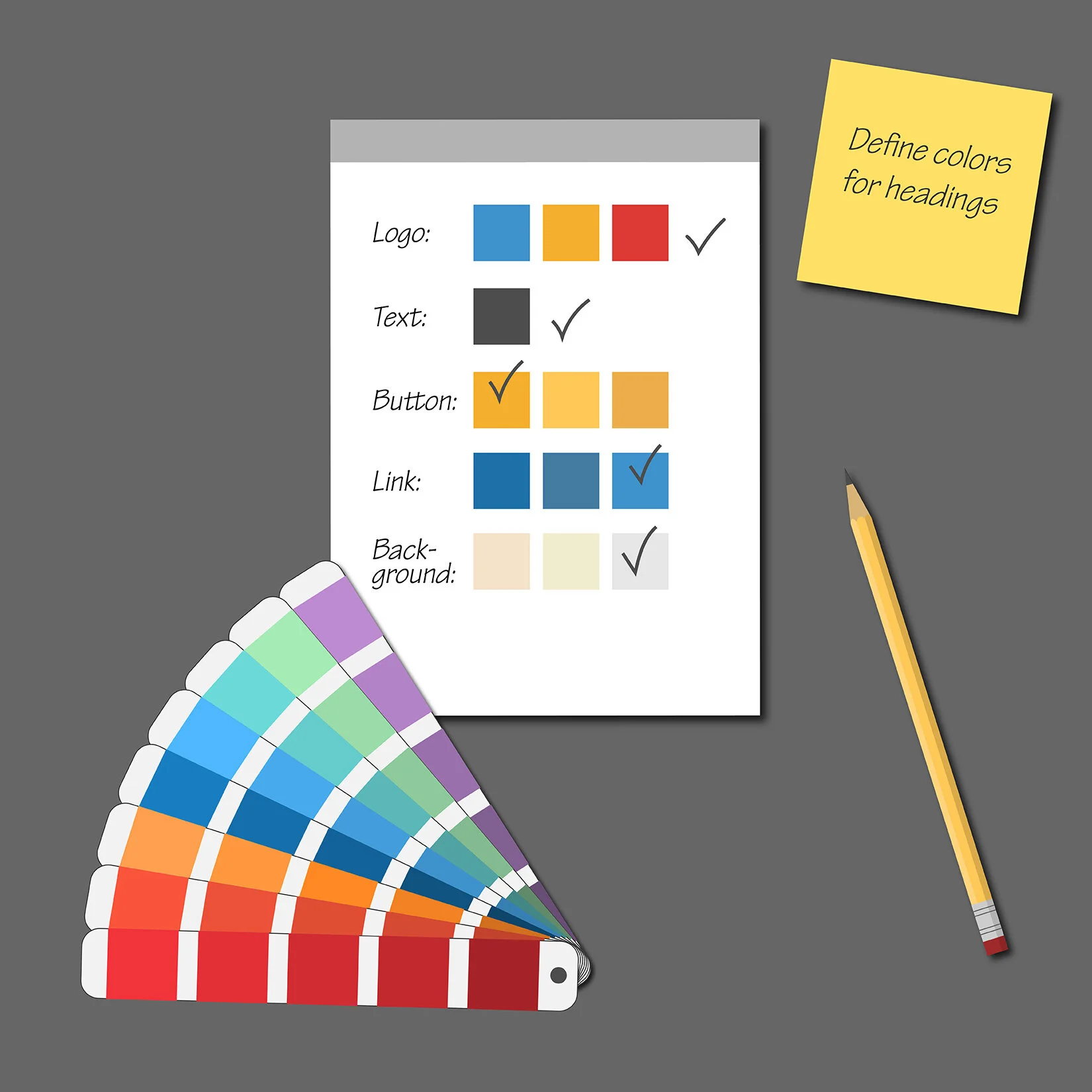
The first cornerstone is the HTML coding language, which stands for HyperText Markup Language. HTML describes your page using elements called tags. Each building block in a template has its own HTML code. For example, if you insert an image block, a text block, or a newsletter subscription block, Squarespace automatically generates the HTML code associated with those building blocks every time a user requests your page. However, these blocks look plain in their default styles. If you do not change these styles, then, yes, your website will look like a template. But you can customize these default styles to suit your specific color scheme, background pattern, and font choices (▶︎ Decoding Typography).
Styles are part of the second cornerstone. They are usually defined in so-called Cascading Style Sheets, CSS for short, and apply to your entire site. CSS is an innovative concept that allows you to set your styles for groups of tags (classes) or just for specific elements (tags). If you need more targeted style changes, you can insert them as Custom CSS, a standard feature in all Squarespace templates. Before playing with Custom CSS, please note that you must have coding experience; otherwise, you risk accidentally breaking your website. You may want to let your web designer do this kind of work.
The third and final cornerstone is JavaScript, a real-time scripting language that web browsers understand. JavaScript is used, for example, to move slides in a slideshow, reveal hidden text after clicking the "Read More" button, or, in general, trigger a particular action if a specific event occurs.
In summary, templates are only a starting point. Whether your final website will look unique and special depends heavily on how you or your web designer want to use the almost endless possibilities that these three cornerstones offer.
Nothing is worse than being caught wearing the same outfit as your next-door neighbor at a dinner party. Most entrepreneurs show the same fear when it comes to their business. Everyone, including us, wants their company to stand out. That is normal and understandable since we have all advertised to promote our brand, trying to be unique. A website is not that different. However, there are many ways to set your business apart. The flow of your website, its color scheme, and the choice of fonts can already lead to some differentiation. However, the strongest differentiator in your toolkit is the purpose of your business - its story (▶︎ Does Your Website Show Purpose?). Telling this story in your words and with your images creates a unique emotional connection with your visitors. And that is what makes your website special and not look like a template.
